Features
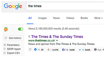
- SEObar
Get an instant SEO summary for any webpage you’re browsing with the interactive SEObar that can be adjusted to your needs or switched off completely.

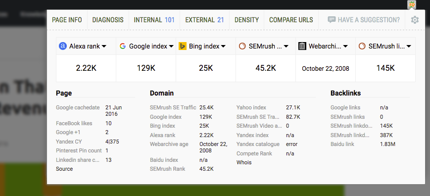
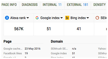
- SEO Dashboard
Not a big fan of extra bars in your browser? Meet the SEO dashboard! One click will open a compact, yet informative lightbox with a brief SEO overview, including Page, Domain and Backlinks details.
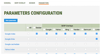
- SERP overlay
Get a thorough analysis of SERPs and export the results in CSV format.
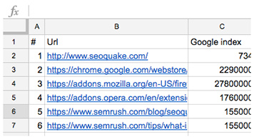
- Vast Data
Semrush, Alexa, Google rank, Yahoo index — you name it! Switch between a great choice of reliable data sources and types, including social media elements, like Tweets and Facebook Likes.
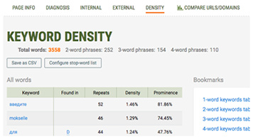
- Keyword Analysis
Get a detailed and structured report on all keywords found on the page. Visualize data in the keywords cloud and narrow down your search using powerful filters.
- Print & Export
Export your SEOquake data with style! With SEOquake, it’s easy to save data from any of the reports into a .csv file, or better yet — print it out.